Graduation project : Pin Pals
Onboarding Communication System - Making digital banking feel human, tangible, and easy to trust.
Role
Graphic Design Intern
Client
Kotak 811
Industry
Fintech
Duration
6 months

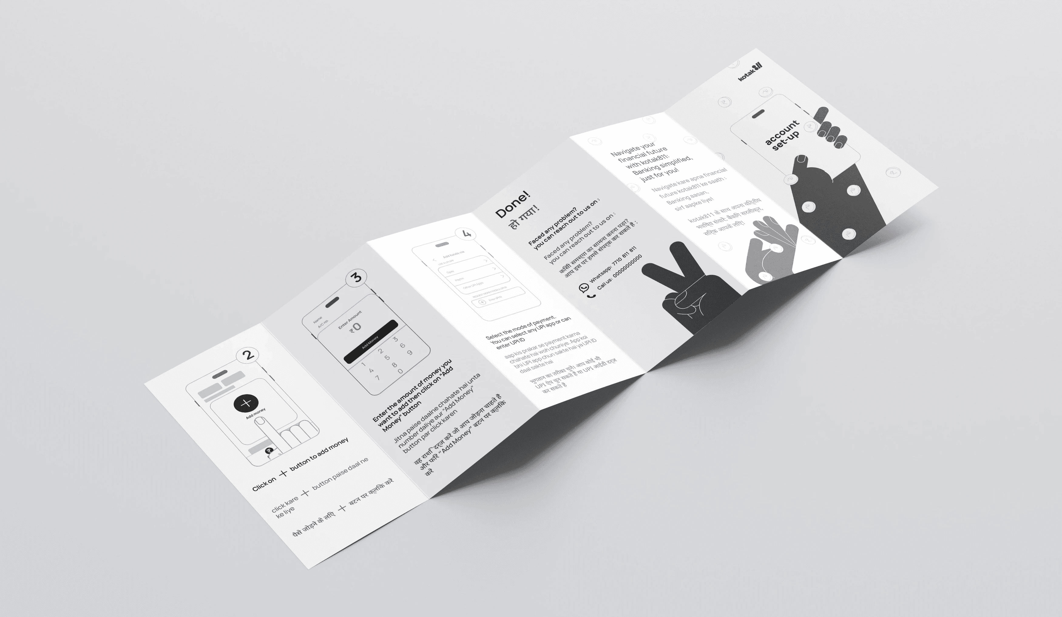
During my graduation project with Kotak 811, a digital-first neobank, I focused on improving onboarding communication for first-time digital banking users. I conducted immersive, on-ground research across branches and VKYC centers in Mumbai, observing real customer interactions, behaviors, and challenges during account setup.


These insights revealed that the core issue was not technology, but a lack of clarity, confidence, and trust in the process.
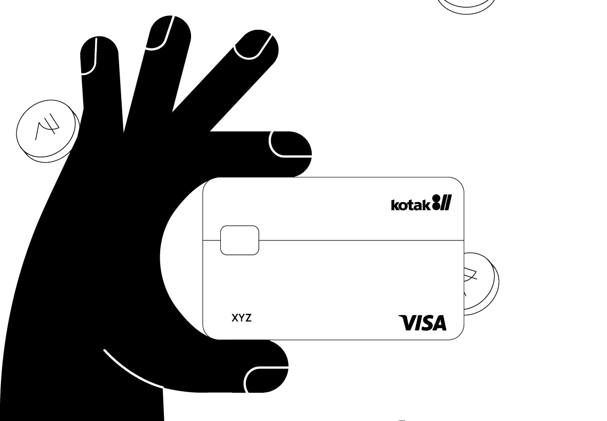
This led me to design a physical communication system integrated into an on boarding welcome kit, debit and credit card packaging, enabling users to navigate the digital journey through simple, visual, multilingual guides in English, Hindi, and Hinglish.

Other projects

Chocolate Melting Machine - Interface Design (HMI)
Designing a clear, chef-friendly control interface for a professional kitchen device.

Medical Software Interface Redesign
Redesigning of quality control section, landing page & dashboard of a data monitoring and quality control software.
Graduation project : Pin Pals
Onboarding Communication System - Making digital banking feel human, tangible, and easy to trust.

Comic Book Design
From character design to story writing, a personal project to explore the art of making a comic book.

Athleisure Wear Rebranding
Repositioning a streetwear label into a performance-led athleisure brand.