Medical Software Interface Redesign

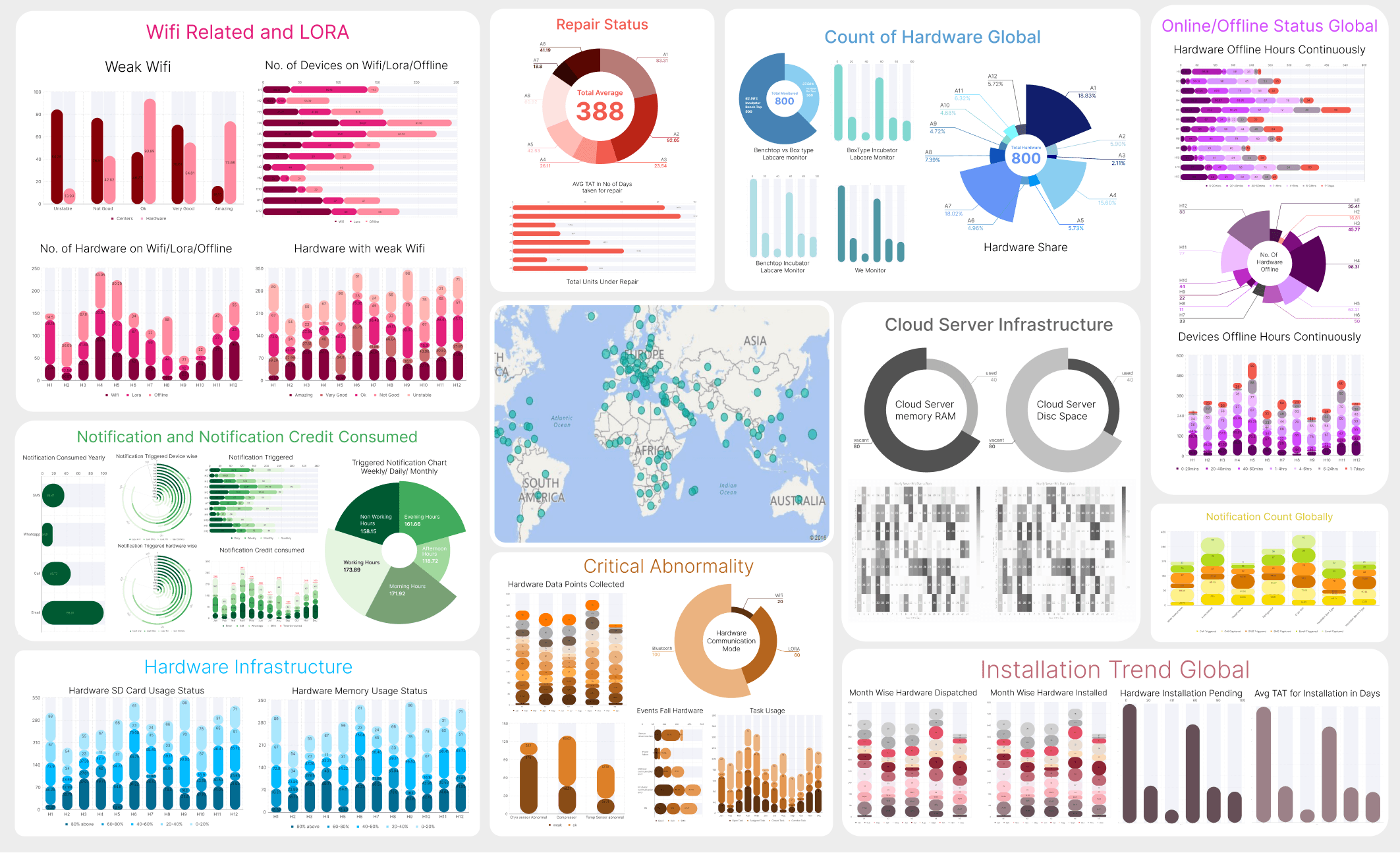
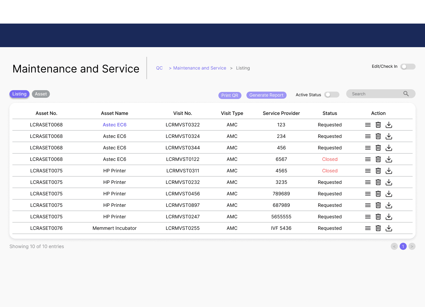
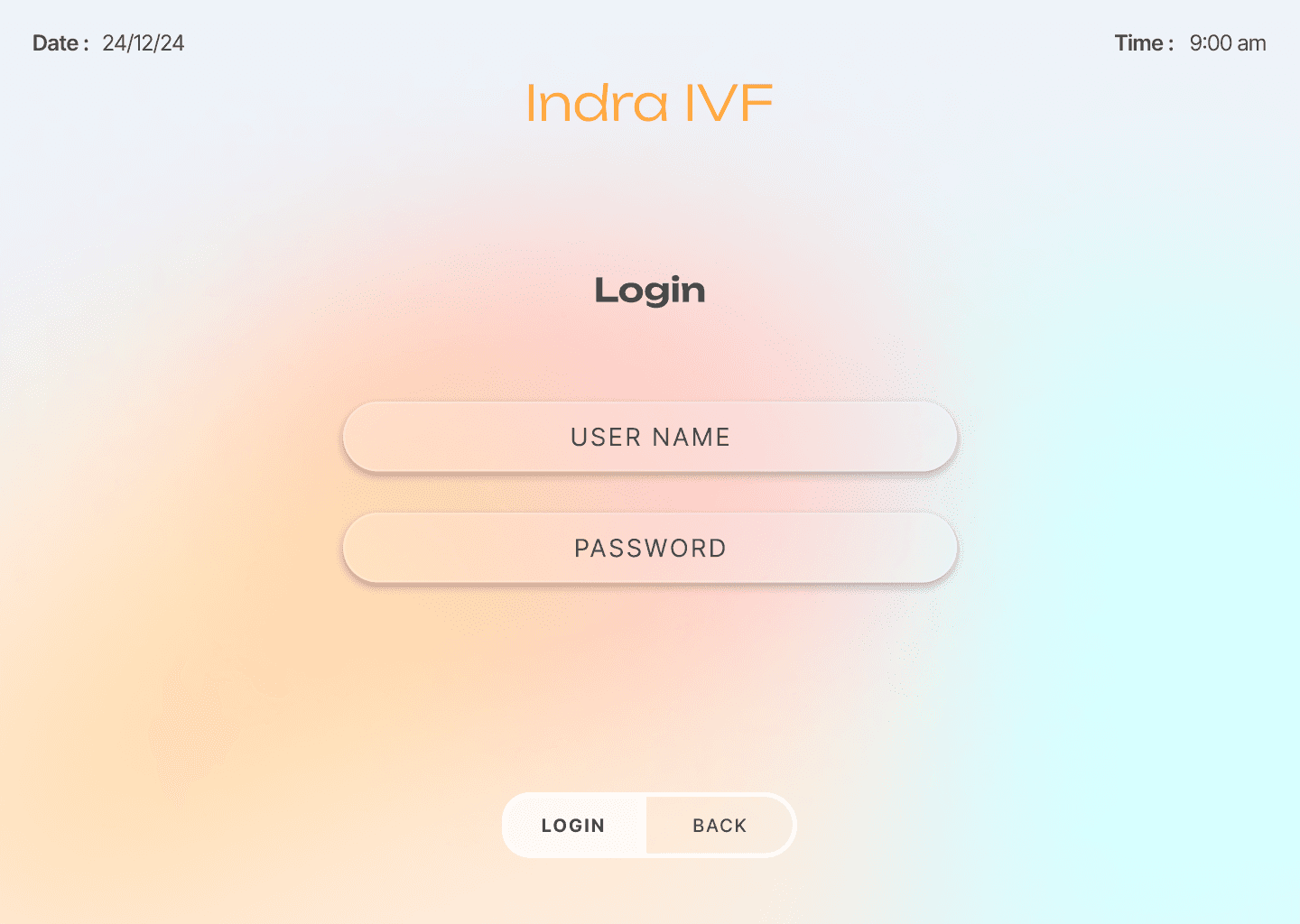
Redesigning of quality control section, landing page & dashboard of a data monitoring and quality control software.

Role

UX/UI Design

Client

Shivani IVF

Industry

IVF

Duration

6 months

image 1
image 1
image 1

Context

  • The Client : Shivani, a long-standing client specializing in IVF technology, an industry with zero margin for error.


  • The Project : Redesign a data monitoring and quality control system called Labcare for IVF clinics and hospitals.


  • The System : Pulls real-time data from lab equipment and tracks quality control records for compliance.


  • The Users : Doctors, nurses, administrators, and lab technicians, each with different workflows and varying tech proficiency.


  • The Stakes : Ensuring critical information reaches the right person at the right time in a high

image
image
image

Problem

  • No user access : Designing for doctors, nurses, and lab technicians without direct contact, relying solely on a client who communicated in dense technical and medical jargon.


  • Steep learning curve : Had to understand IVF machine operations, data outputs, and real-time clinical workflows from scratch.


  • Inherited chaos : Existing software had cluttered screens, inconsistent layouts, and poor visual hierarchy, critical information was buried, wasting medical professionals' time.


  • Technical constraints : Dev team's rigid framework limited design possibilities, every decision had to pass a technical feasibility check.


  • The balancing act : Finding the narrow intersection between medical accuracy, practical usability, and technical buildability without direct user feedback to validate decisions.

image
image
image
image
image
image
image
image
image

Solution

  • Reframing the system : Transformed it from a data dump into a decision-support tool mapping what each metric meant, who needed it, and when.


  • Workflow simplification : Reorganized the quality control section (which mirrored clinic paperwork) by grouping related inputs, eliminating redundancy, and creating cleaner layouts.


  • Scenario-based design : Without user access, stepped into the roles of doctors, nurses, and admins to anticipate navigation patterns and establish clear information hierarchy.


  • Engineering collaboration : Worked within technical constraints adapting patterns, reusing functional elements, and maintaining consistency instead of pushing unfeasible designs.


  • Key interface improvements :

    • Simplified, logical navigation paths

    • Clear visual hierarchy for faster data scanning

    • Reduced clutter through strategic grouping and whitespace

    • Cross-screen consistency to lower learning curve


  • Design principle : Every decision aimed to make the interface feel calm, confident, and human even in a high-stakes medical environment.


Curious how the full system looks? It’s under NDA online, but I’m happy to walk you through privately.

Other projects

Interested in connecting?

Let’s talk projects, collaborations, or anything design!

Interested in connecting?

Let’s talk projects, collaborations, or anything design!

Interested in connecting?

Let’s talk projects, collaborations, or anything design!